- Accessibility
- Forced Color Adjust
Accessibility
Forced Color Adjust
Utilities for opting in and out of forced colors.
Basic usage
Opting out of forced colors
Use forced-color-adjust-none to opt an element out the colors enforced by forced colors mode. This is useful in situations where enforcing a limited color palette will degrade usability.
Try emulating `forced-colors: active` in your developer tools to see the changes

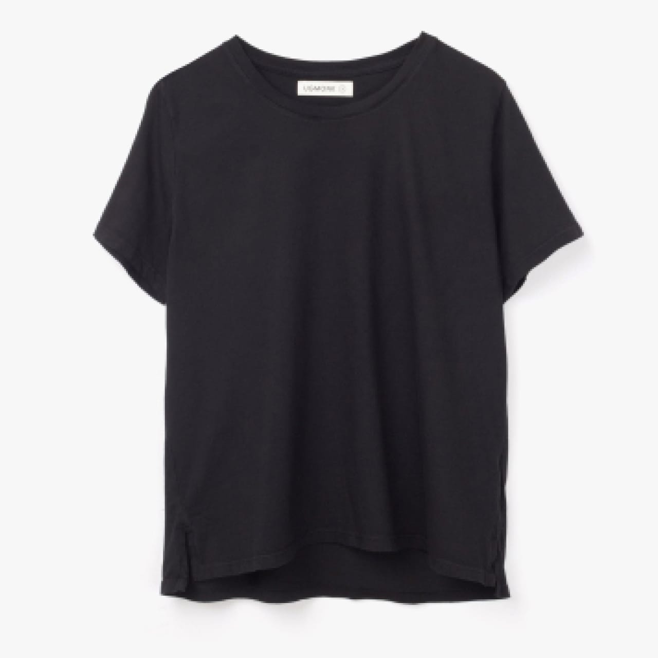
Basic Tee
$35
<form>
  <img src="..." />
  <div>
    <h3>Basic Tee</h3>
    <h3>$35</h3>
    <fieldset>
      <legend class="sr-only">Choose a color</legend>
      <div class="forced-color-adjust-none ...">
        <label >
          <input class="sr-only" type="radio" name="color-choice" value="White" />
          <span class="sr-only">White</span>
          <span class="size-6 rounded-full border border-black border-opacity-10 bg-white"></span>
        </label>
        <!-- ... -->
      </div>
    </fieldset>
</form>
You can also use the forced-colors modifier to conditionally add styles when the user has enabled a forced color mode.
Restoring forced colors
Use forced-color-adjust-auto to undo forced-color-adjust-none, making an element adhere to colors enforced by forced colors mode.
This can be useful if you use a different control on a larger screen size for example:
<form>
  <fieldset class="forced-color-adjust-none lg:forced-color-adjust-auto ...">
    <legend>Choose a color:</legend>
    <select class="hidden lg:block">
      <option value="White">White</option>
      <option value="Gray">Gray</option>
      <option value="Black">Black</option>
    </select>
    <div class="lg:hidden">
      <label>
        <input class="sr-only" type="radio" name="color-choice" value="White" />
        <!-- ... -->
      </label>
      <!-- ... -->
    </div>
  </fieldset>
</form>Applying conditionally
Hover, focus, and other states
Tailwind lets you conditionally apply utility classes in different states using variant modifiers. For example, use focus:forced-color-adjust-none to only apply the forced-color-adjust-none utility on focus.
<a href="#content" class="forced-color-adjust-none focus:forced-color-adjust-auto">
  Skip to content
</a>
For a complete list of all available state modifiers, check out the Hover, Focus, & Other States documentation.
Breakpoints and media queries
You can also use variant modifiers to target media queries like responsive breakpoints, dark mode, prefers-reduced-motion, and more. For example, use md:forced-color-adjust-auto to apply the forced-color-adjust-auto utility at only medium screen sizes and above.
<div class="forced-color-adjust-none md:forced-color-adjust-auto">
  <!-- ... -->
</div>
To learn more, check out the documentation on Responsive Design, Dark Mode and other media query modifiers.

